


This is my first web design project. Everything is still in the beginning, so I hope can get some treasure suggestion from yours. It will help me to improve.
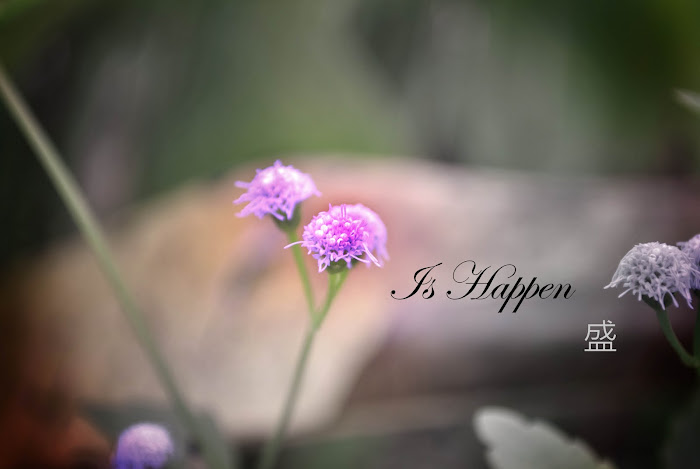
Webdesign: How to boiled a Chinese soup?
Target Audince : Young Adults(age 16 – 25)
Webdesign: How to boiled a Chinese soup?
Target Audince : Young Adults(age 16 – 25)
User Testing Q&A
1. How do you feel about the site
- Warm
- Cute
- Glamorous
- Colorful
- Others : _______________________________________
2. How is the color mode of the site?
- Harmony
- Cute
- Funny
- Others : _______________________________________
3. How about navigation? Is it easy to understand?
A. Yes.
B. No. A little complicated. Took me a bit to get it.
C. I don't understand it at all.
4. Can you understand what is this website about?
- Yes, please tell me about it.
It ________________________________________
- No
_______________________________________
5. Do you know to boil soup or to cook?
- Yes
- No
6. Do you learn something after viewing this site?
- Yes
- No, why?
- Others : _______________________________________
7. Regarding the typography, is the font easy to understand/read?
A. Easy to read
B. Moderately easy to read
C. Not really easy to read
D. Difficult to read, why?
8. What do you like best about the interface design?
A. Typography
B. Colour choice
C. Logo design
D. The patternE. Everything
9. Would you visit this site again?
A. Yes - Why?
B. No - Why?
10. Do you have any other comments or opinions to share about the typography, colours, or the
interface in general?


3 comments:
1.warm
2.Harmony
3.its looks ok...
4.teach ppl how 2 cook chicken soup, or something related to soup - the big word written there
5.ez ez de...
6.maybe?
7.izzit all ur pix blur? cz whn i enlarge it cant read the words d.. so can't comments on this.
8. i like the patterns& colors
9.maybe, if i need information about soup.
10.Everything looks fine to me.cz i cant really see the content, so can't comments much about it!!
anyway, good luck, xD
User Testing Q&A
1. How do you feel about the site
- Warm
2. How is the color mode of the site?
- Funny
3. How about navigation? Is it easy to understand?
A. Yes.
4. Can you understand what is this website about?
- Yes, please tell me about it.
It's about a tutorial site that teaches its users to cook soup.
5. Do you know to boil soup or to cook?
- Yes
6. Do you learn something after viewing this site?
- Yes
7. Regarding the typography, is the font easy to understand/read?
A. Easy to read
8. What do you like best about the interface design?
B. Colour choice
9. Would you visit this site again?
A. Yes
It's because I love food with nice pictures and you're site is beautiful
10. Do you have any other comments or opinions to share about the typography, colours, or the
interface in general?
1. I think that your navigation buttons should have a slight drop shadow, as now it looks very flat.
2. The octopus picture doesn't look pleasant in your website. It's too contrast. I think you should find another better picture.
3. There are some spelling errors in your website. Eg: Commonly Used Ingredients, About Soup page spelling is different from the navigation button, Tutorial should be tutorials if more than one.
4. I think you should change your typeface for the contents and titles. Not very suitable. But the buttons for navigation is ok.
1.warm
2harmony
3.ok
4.ya..cook soup lo
5.haha..dunoe
6.yes..how to cook soup
7.b
8.color choice
9.mayb if i need information to cook the soup
10.I'm ok with it
Post a Comment